Branding
Care Vigour
Care Vigour helps people care for their loved ones without losing sight of their own wellbeing. Founded by Nisha, it offers workshops for professional and home caregivers on giving care and recognising the risk of burnout.

 C - Encompassing Care
 V - The hand that helps
 Heart - The core of Care
 Care Vigour
Nisha got in touch for a brand identity with a pop-up stall just two weeks away, and a few ideas of her own — a monogram mark with C and V of the name that’s a play on “caregiver”, some notion of the tree of life and simplicity in design.
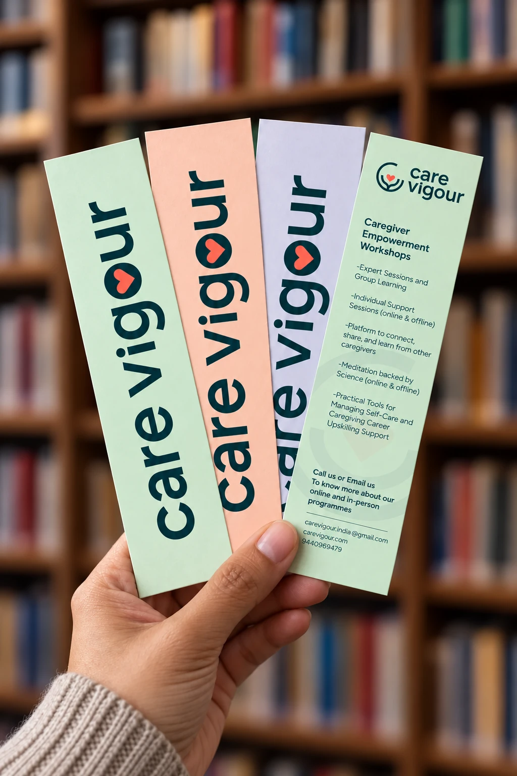
The bookmarks were Nisha's idea, something for visitors to take home at her pop up. The way to make it special was to build it as a set, so every visitor could pick their own and the whole table stayed colourful. Her workshops sit on the back, a quiet reminder that help is just a hello away.
A hello to take away.
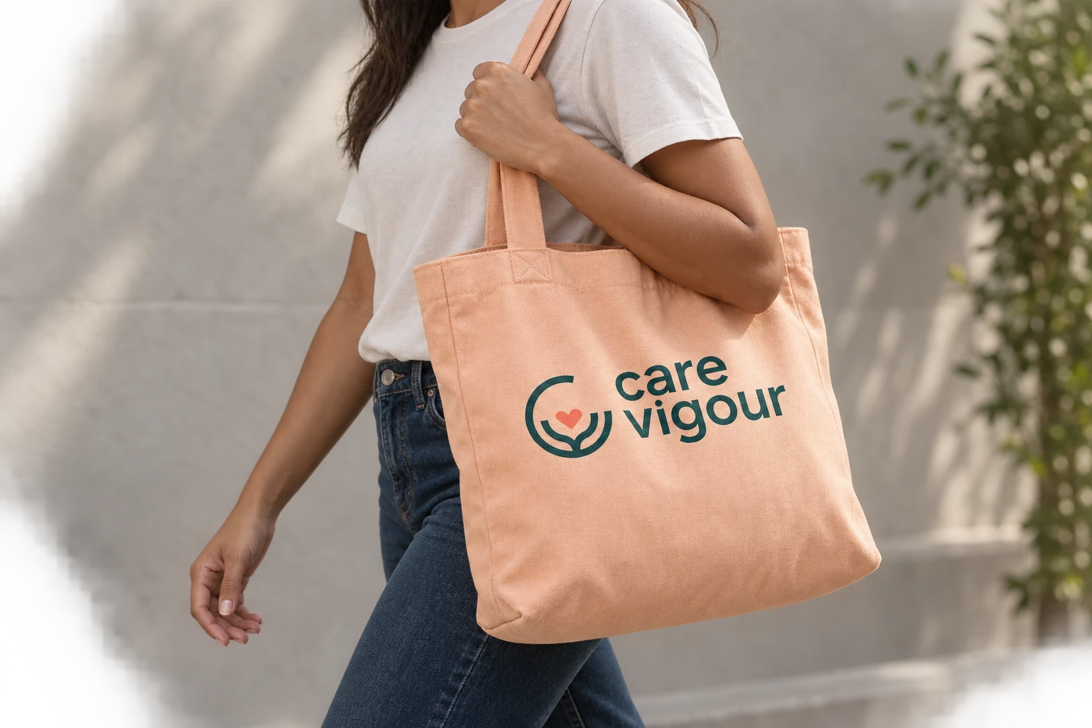
The brand identity gathers her directions and connects it with the purpose into a warm, approachable visual language, making the first conversation feel a little easier.
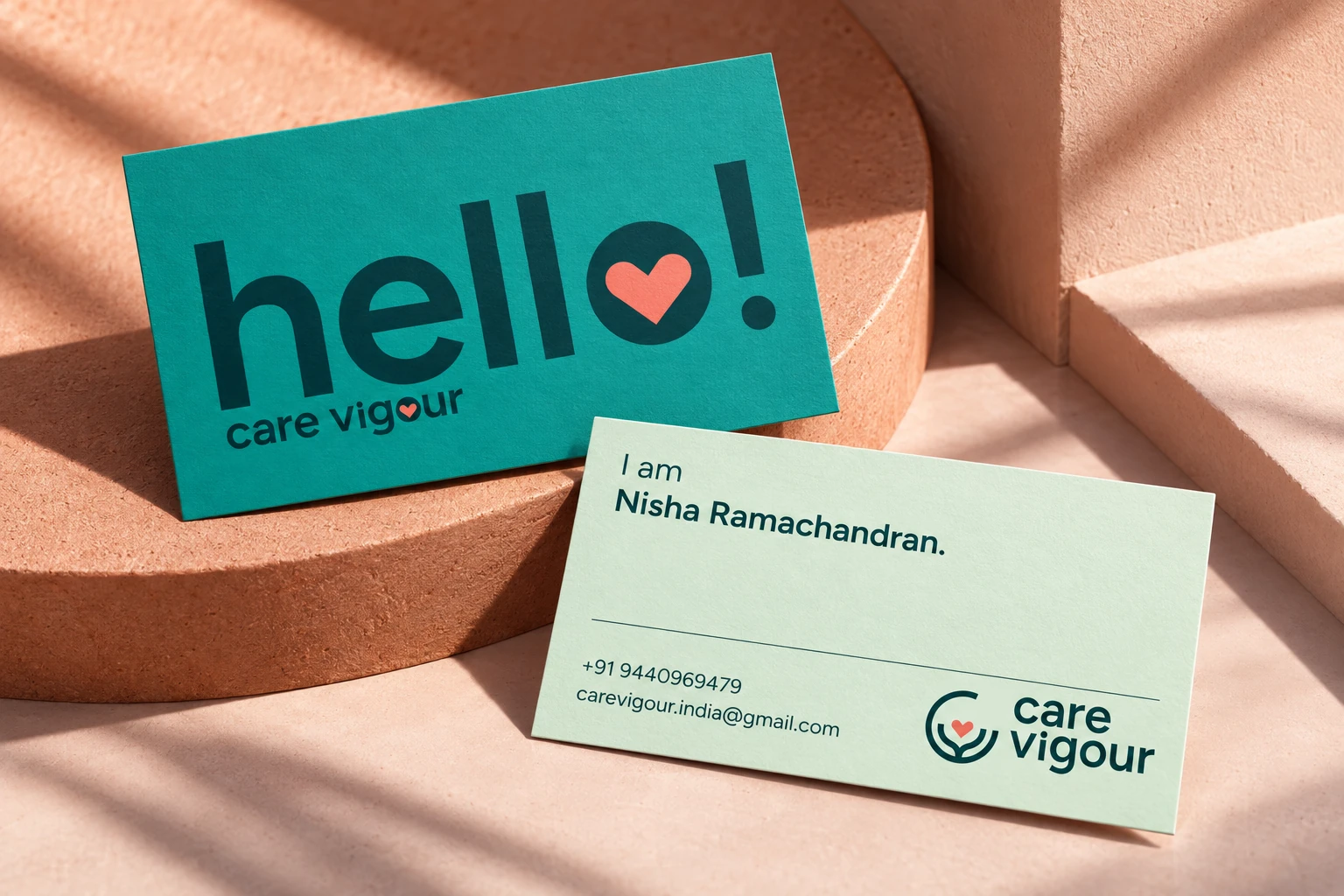
This warmth carries into the visiting card as well, which opens the way any conversation does, with a hello. Nisha was only beginning to talk about Care Vigour in new rooms, so the card had to be as engaging in the hand as the conversation it was meant to start. It was unlike any card she had seen, and she took a day to sit with it before coming back to say that the more she looked at it, the more she loved it.
Colour palette
- Deep green
#083D41 - Teal
#028E83 - Mist
#DFF3DD - Coral
#F87B69 - Peach
#FCD2BC - Lilac
#E0DFED
“Almost all of them loved the bookmark and remembered my name the next day I met them. Thank you so much for making it happen Uma.”
Still life in watercolour