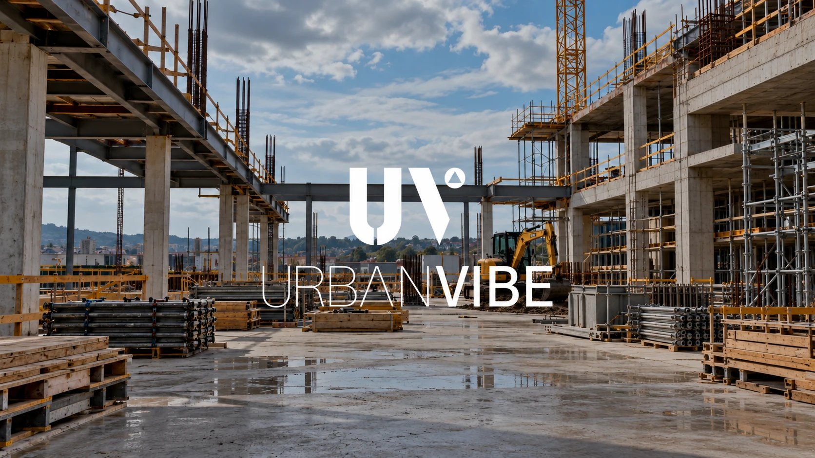
UrbanVibe
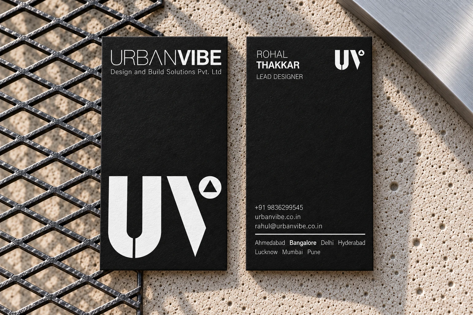
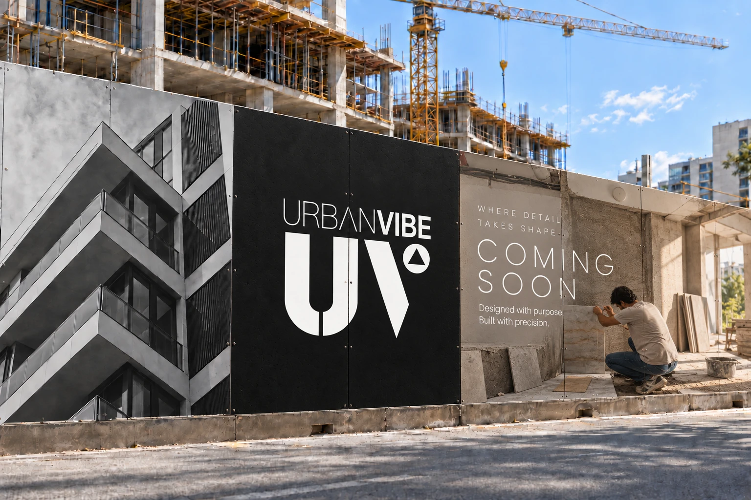
UrbanVibe is an Interior & Construction firm that came with nothing but the name and a request for a modern yet classy identity. Everything else was open, and for a brand that makes spaces, the natural place to begin was where every space begins.

In Francis D.K. Ching's Form, Space and Order, all design grows from four primary elements: point, line, plane and volume. The sketches explored these primary elements in different combinations to create the visual grammar for the logo. Ultimately, the U became the plane, while the V was formed of the line and point.
Within the point sits another layer of the concept: the north arrow that orients every architectural plan. It gives the mark its direction, the way it gives a drawing its bearings, and keeps the whole thing always moving up. The sketches trace how the idea found its final form, one version at a time.
The font was kept clean, minimal and formal with Gothic A1. Its restrained letterforms keep the wordmark clear while allowing the constructed mark to remain the visual focus across the identity.
Gothic A1
Aa Bb Cc Dd Ee Ff Gg Hh Ii Jj Kk Ll Mm Nn Oo Pp Qq Rr
Ss Tt Uu Vv Ww Xx Yy Zz
0123456789

“You took the time to understand our profession, our vision, and the kind of identity we wanted to create. […] Every element has a purpose and connects beautifully with the world of interiors and design.”