Nilima Pisharody — website design
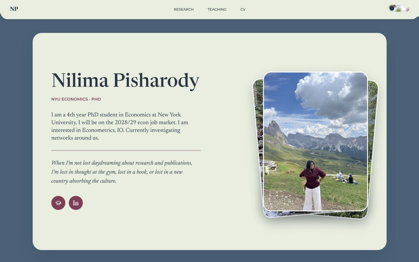
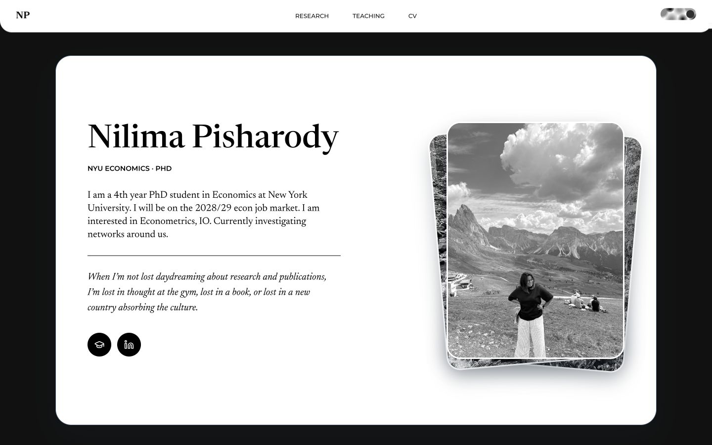
How do you build a website for extremely serious research and an extremely unserious, whimsical person? That contrast became the starting point: a professional home for Nilima’s work that leaves room for her personality.
Nilima deserves just as much credit for driving the design. She knew exactly how she wanted it to feel. My job was to translate those feelings and wants into a visual language that could hold both sides of her.



Highlights
Select a photograph to bring it forward. Select the front photograph to advance.
The photo deck
A little play in the introduction.The toggle
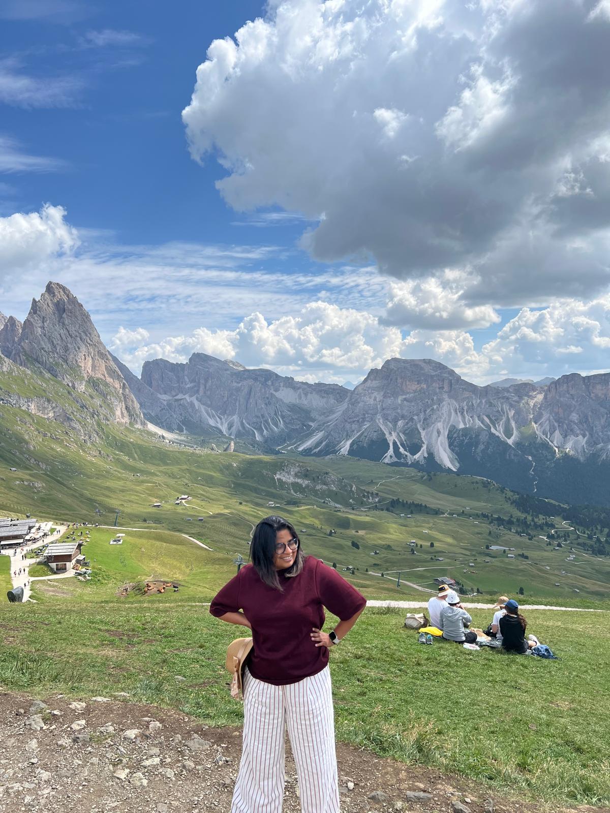
A small detail, shaped in Figma.A quiet slate and sage palette gives the research space to breathe, while berry brings warm details into the page. The visual language stays clear and readable for serious research, holding enough softness to keep the experience welcoming. Newsreader gives longer passages an editorial voice suited to the profile and research; Montserrat provides a precise counterpoint for navigation and interface details. Together, these roles keep the page calm, legible, and warm while letting Nilima’s work remain the focus.
Visual style
- #46627A
- #E8EDDE
- #853955
- #253441
- #FFFFFF

Newsreader
An editorial serif gives serious ideas a welcoming voice. Its softer forms bring warmth to the profile, with a reading rhythm suited to research and longer passages.
Montserrat
A clear, precise counterpoint for navigation and the small details that guide a reader.